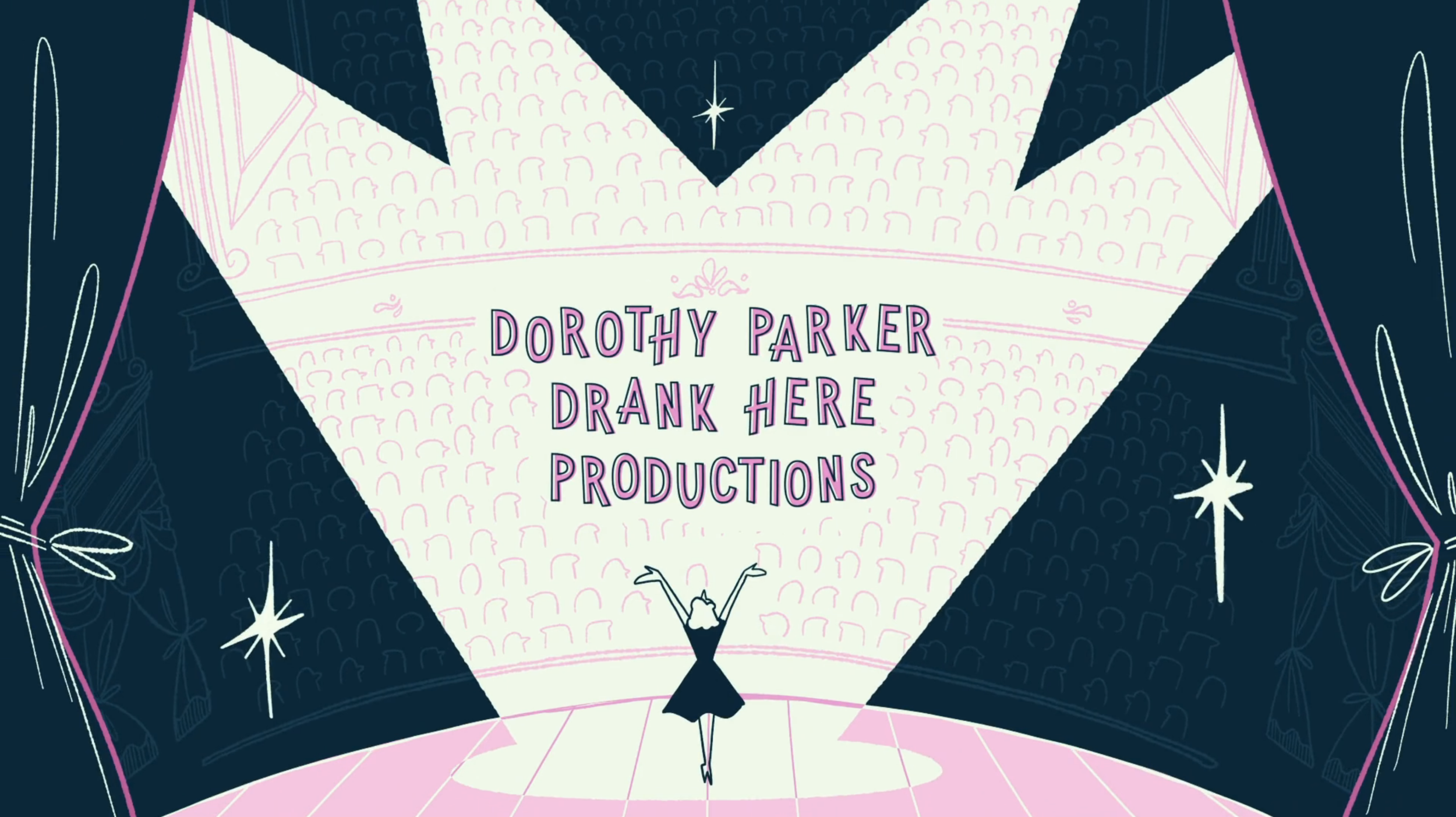
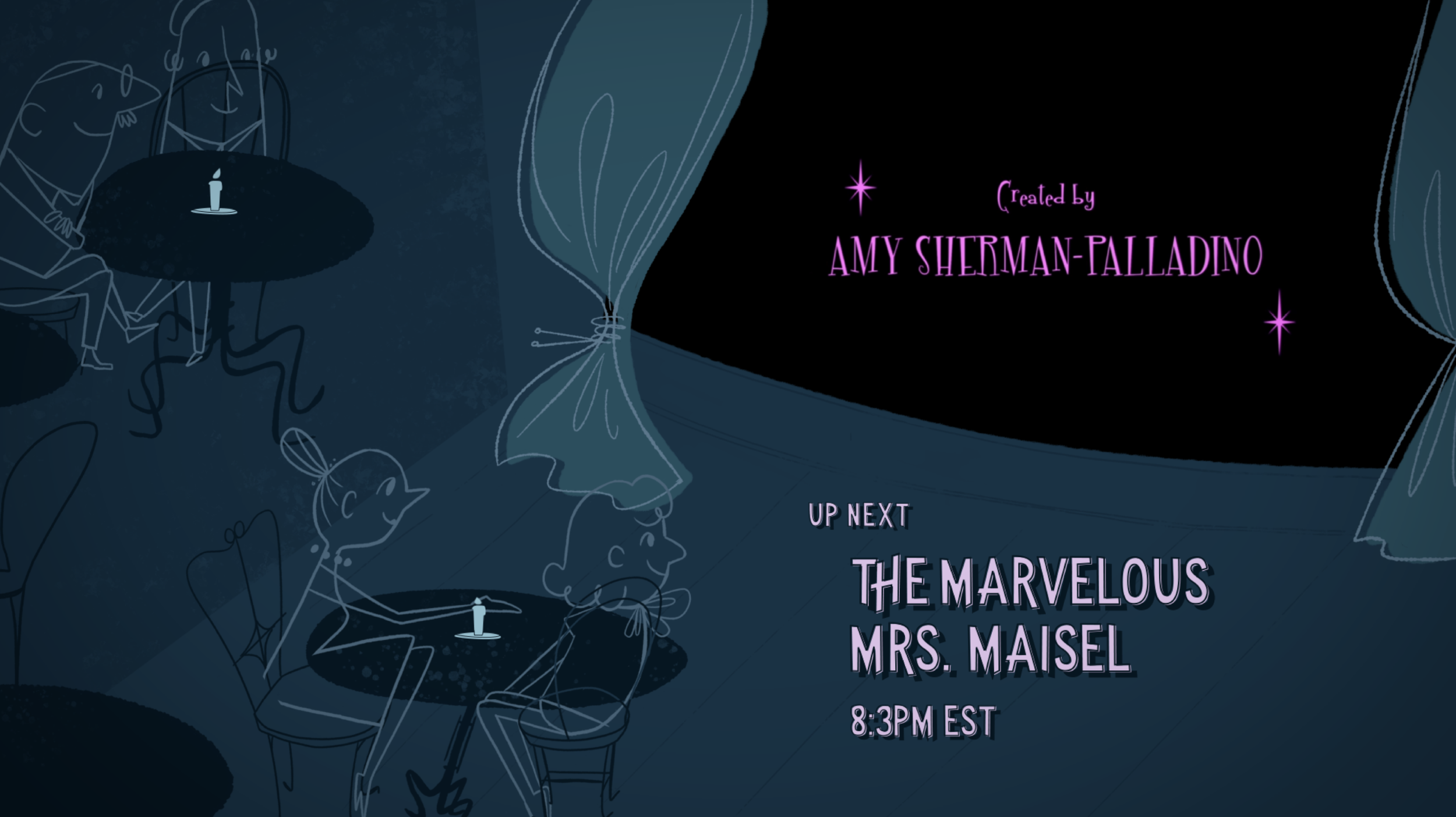
The marvelous mrs. maisel show package redesign
Design/animation/show package
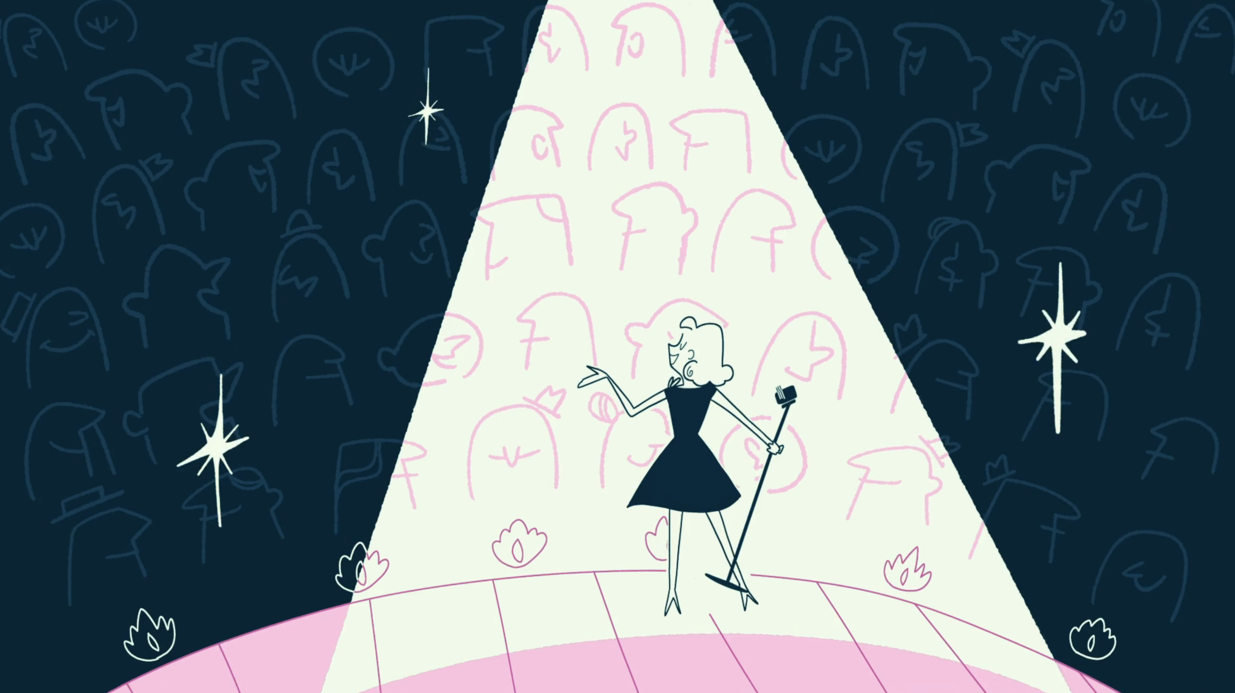
The Marvelous Mrs. Maisel has a setting and premise unique in the TV landscape today: 1950’s New York Jewish housewife navigating her way through the male dominated world of stand-up comedy. This provides an abundance of material to draw from to develop a brand unique to The Marvelous Mrs. Maisel that unites the show’s visual presence across TV platforms and form an association in audiences’ mind between the show and the network.
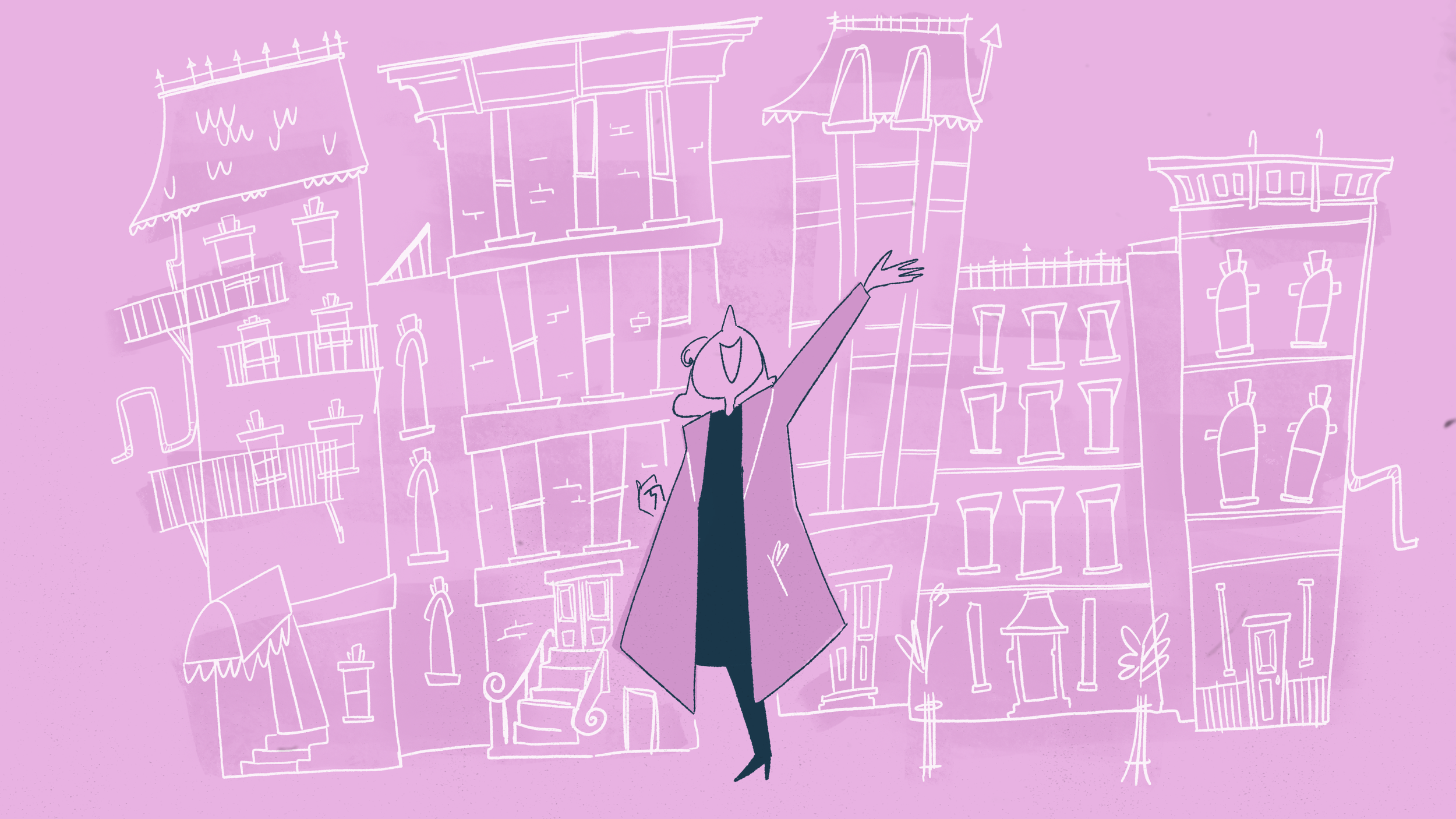
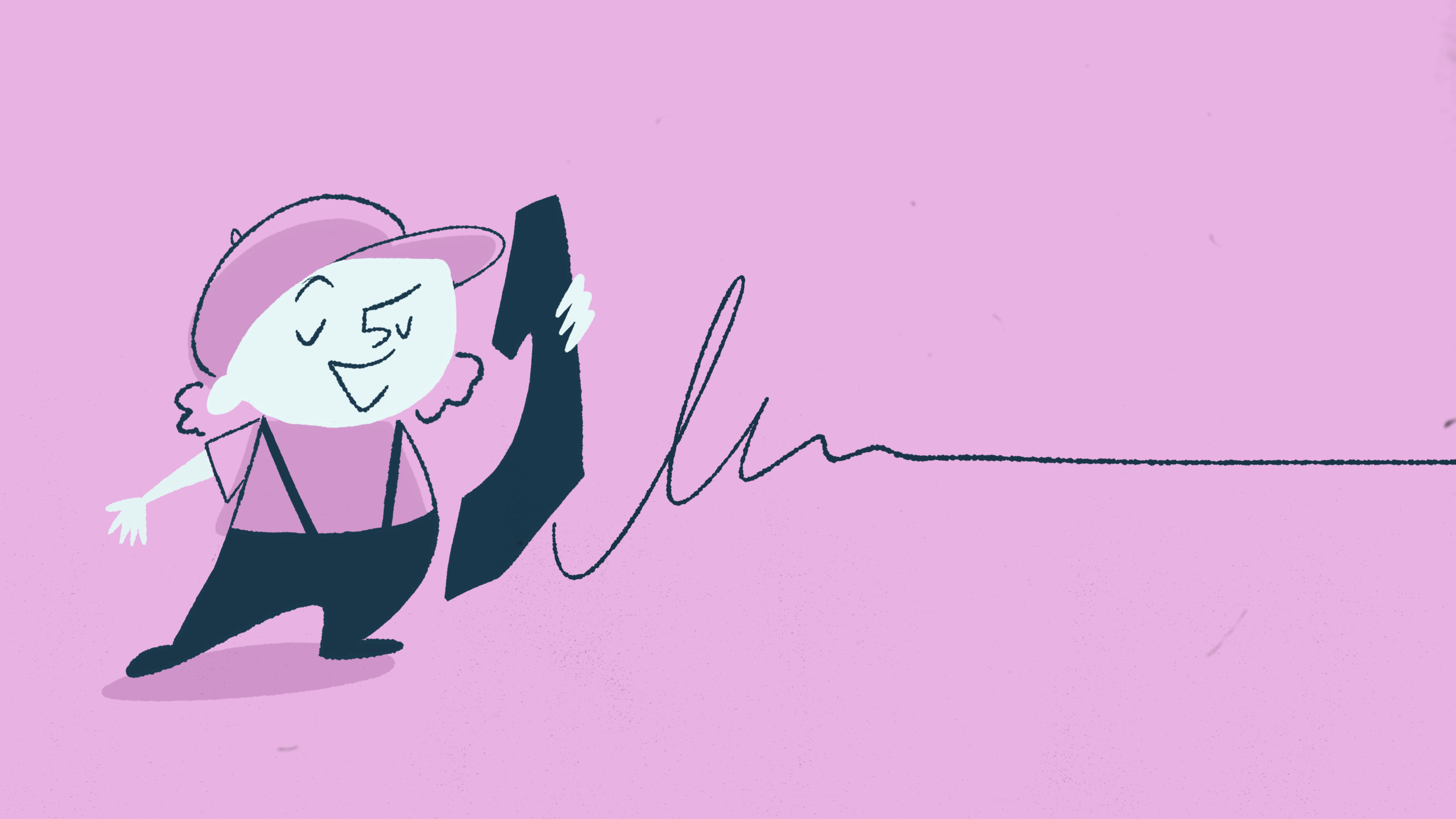
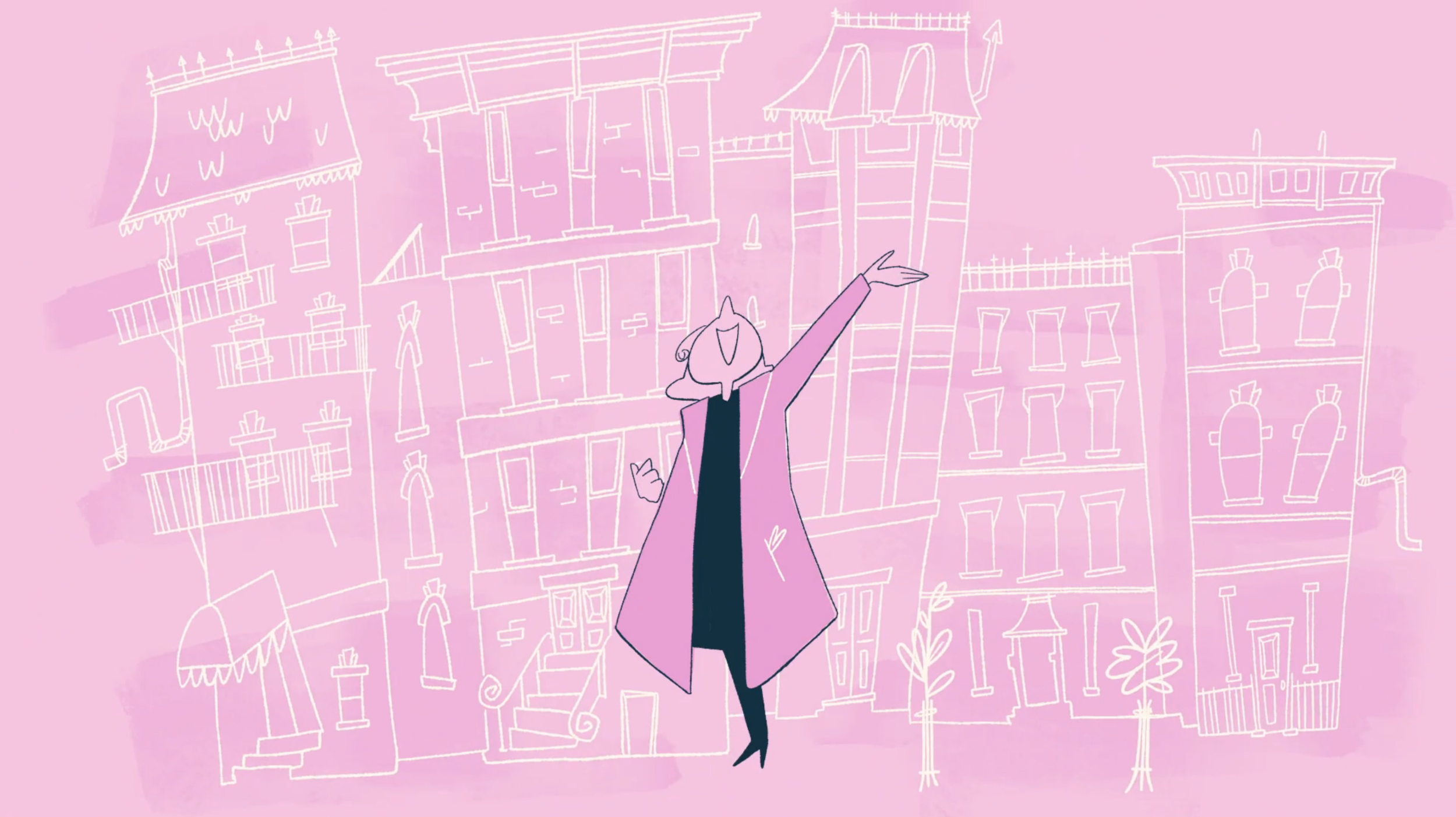
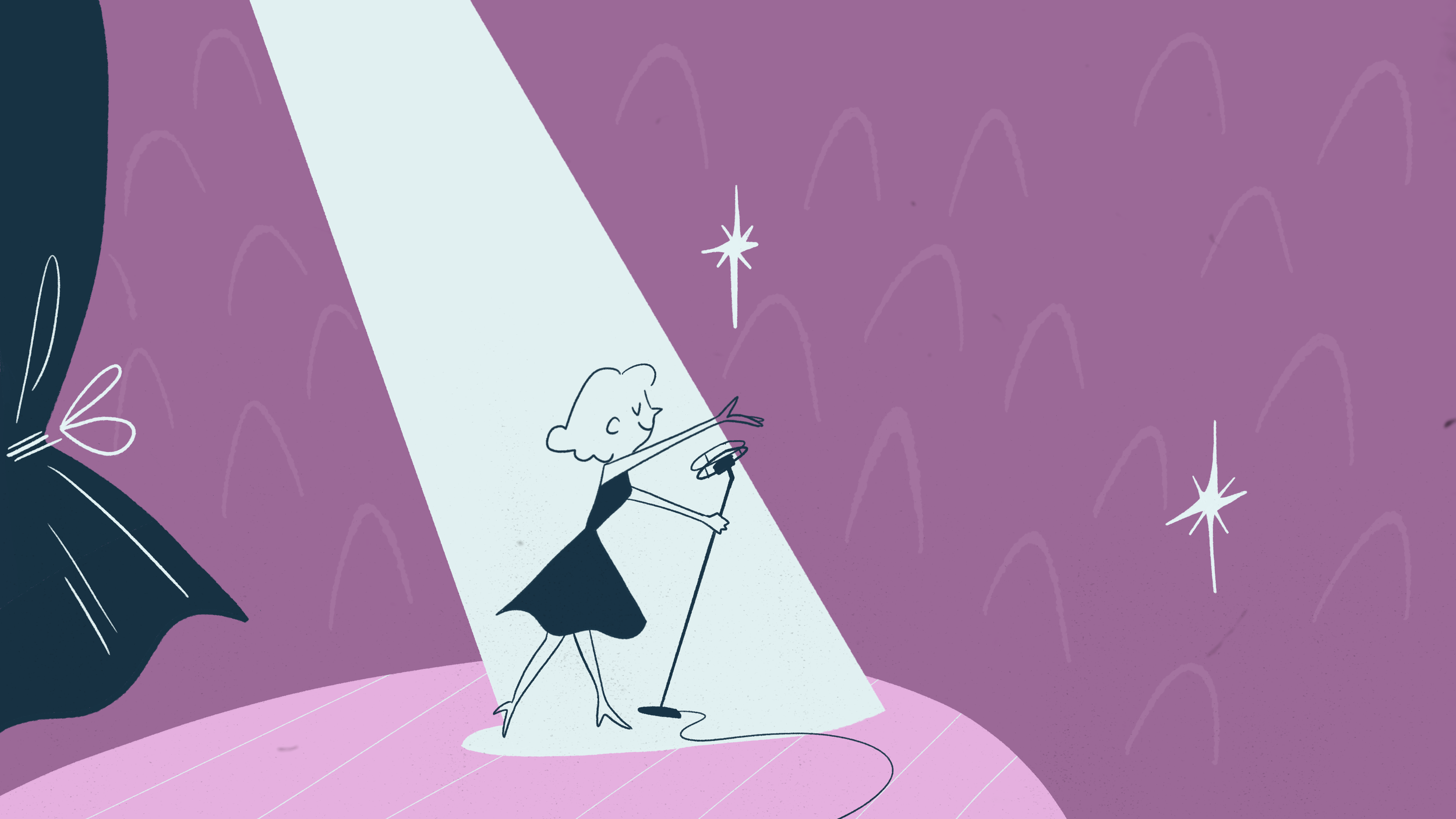
The Marvelous Mrs. Maisel draws in audiences into its thoughtfully crafted world of mid-century New York City with its rich details, music, and costume design. The sequence follows Midge as her Orthodox Jewish life blends into her life on stage as the comedienne the Marvelous Mrs. Maisel. The tone of the animation is exuberant and lively, reflecting the tone of the show.
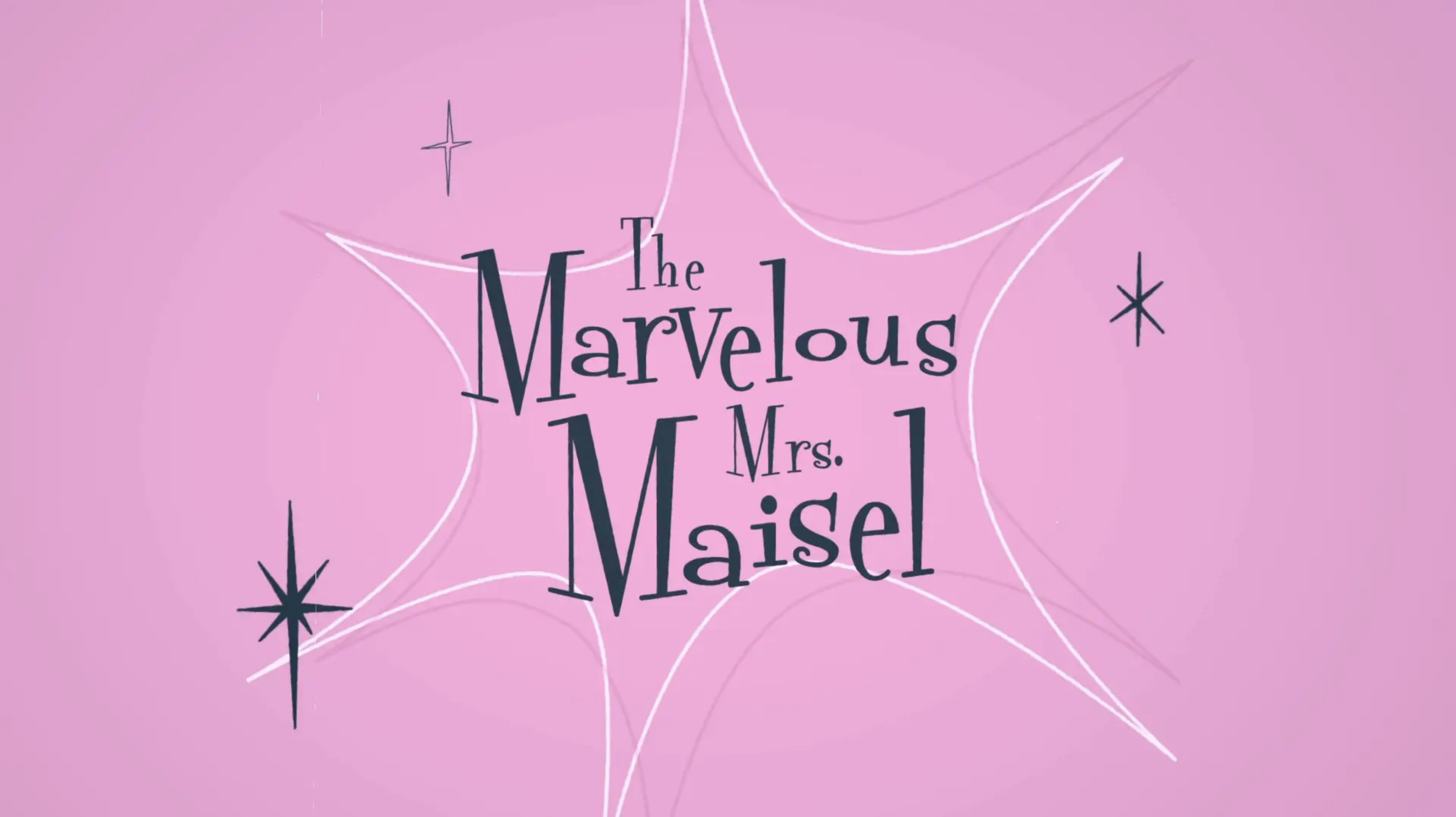
Show title
Toolkit montage
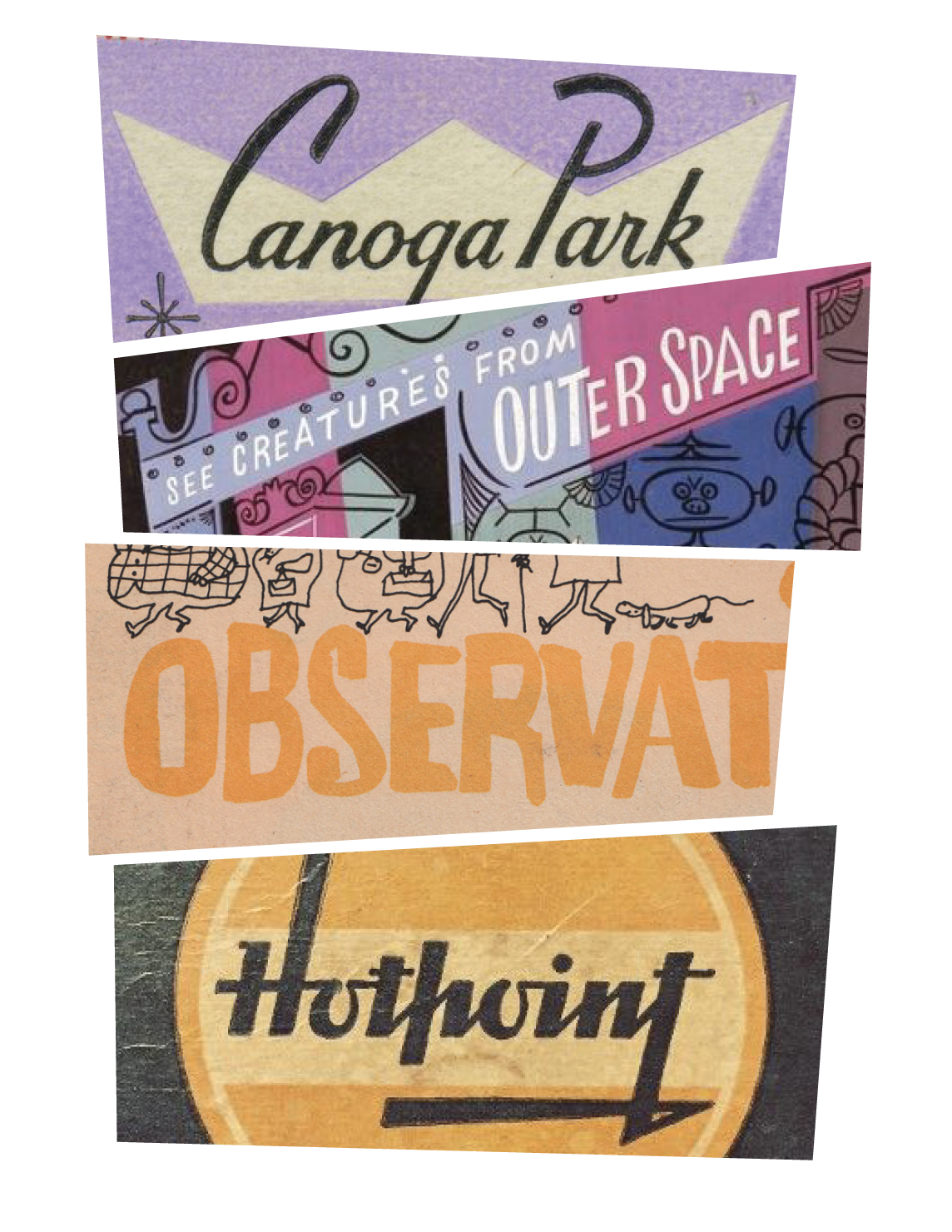
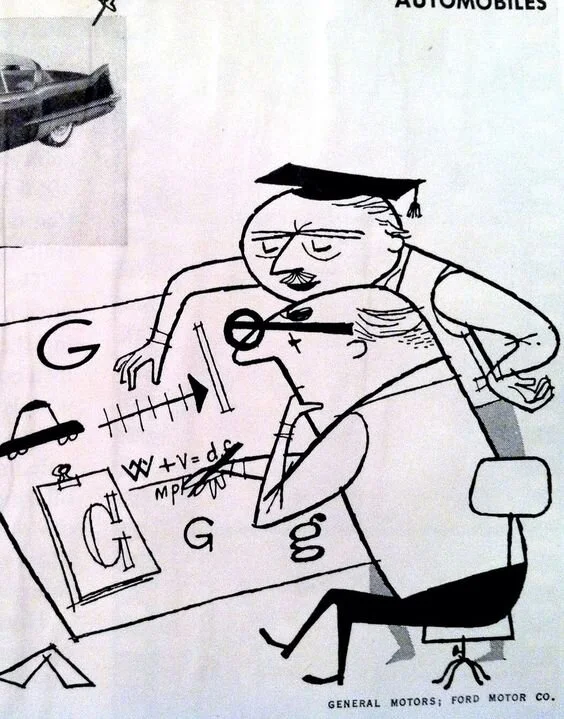
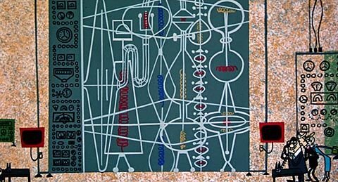
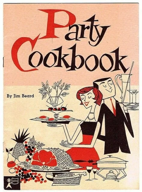
REFERENCE AND INSPIRATION
One of my earliest memories of falling in love with animation was while watching Disney’s animated 101 Dalmations- not the dalmations, but the TV ad for Kanine Krunchies that plays as the puppies go to sleep. Since learning about UPA style animation of the 50’s I’ve been utterly in love with this mid-century American style of ads.
Style exploration
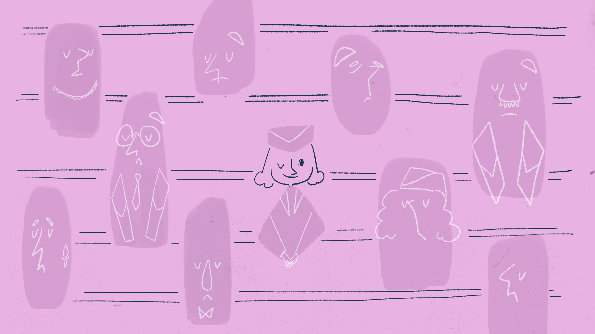


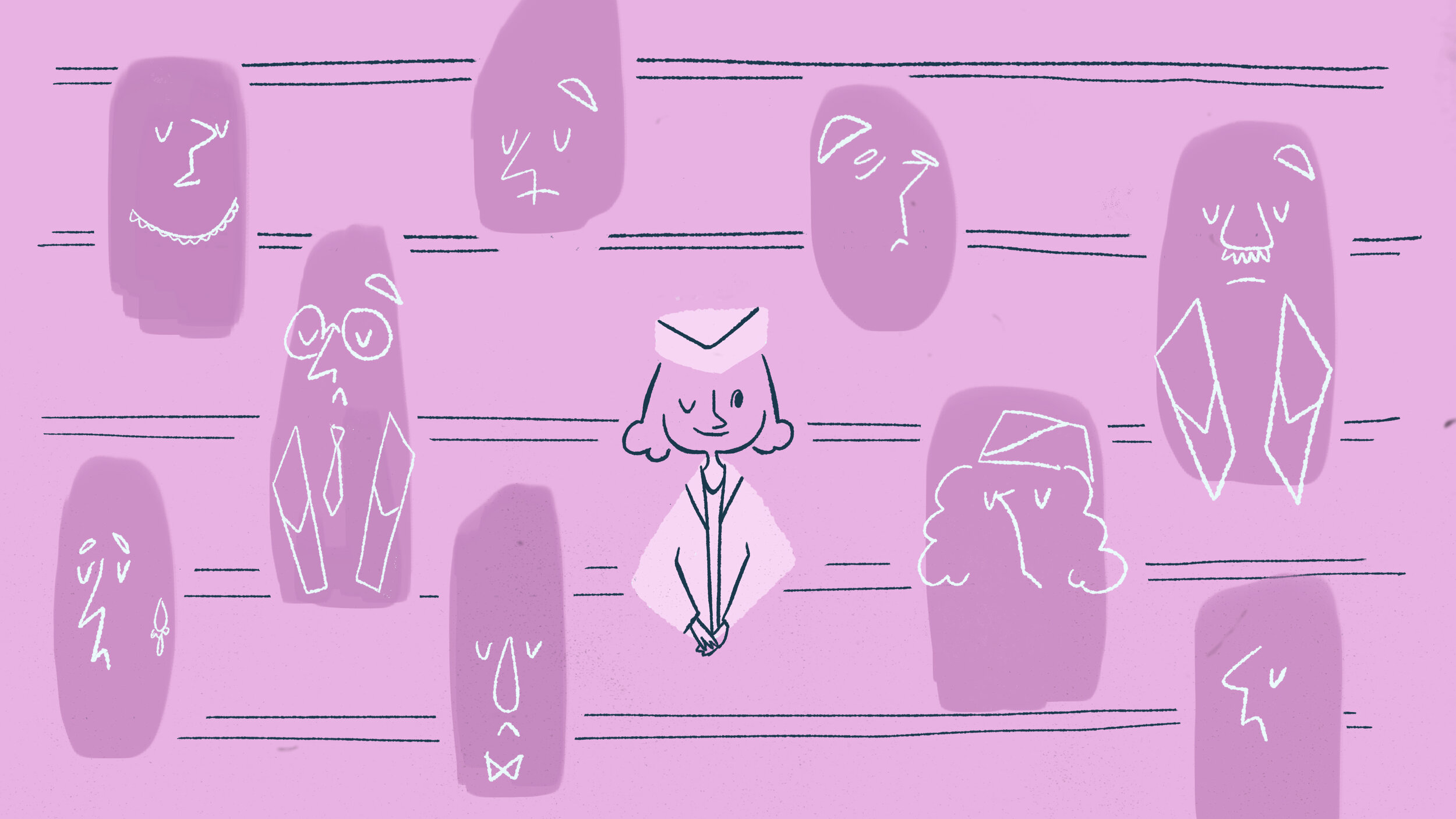
My initial direction had too little detail, or not enough contrast in colors. As I moved forward I tried to keep in mind keeping the subject in focus even with sequence’s quick pace

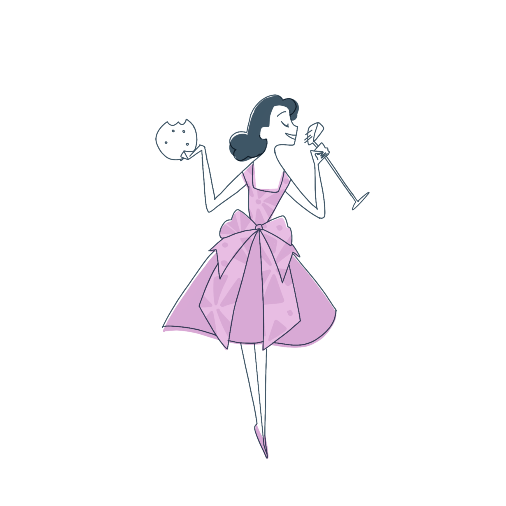
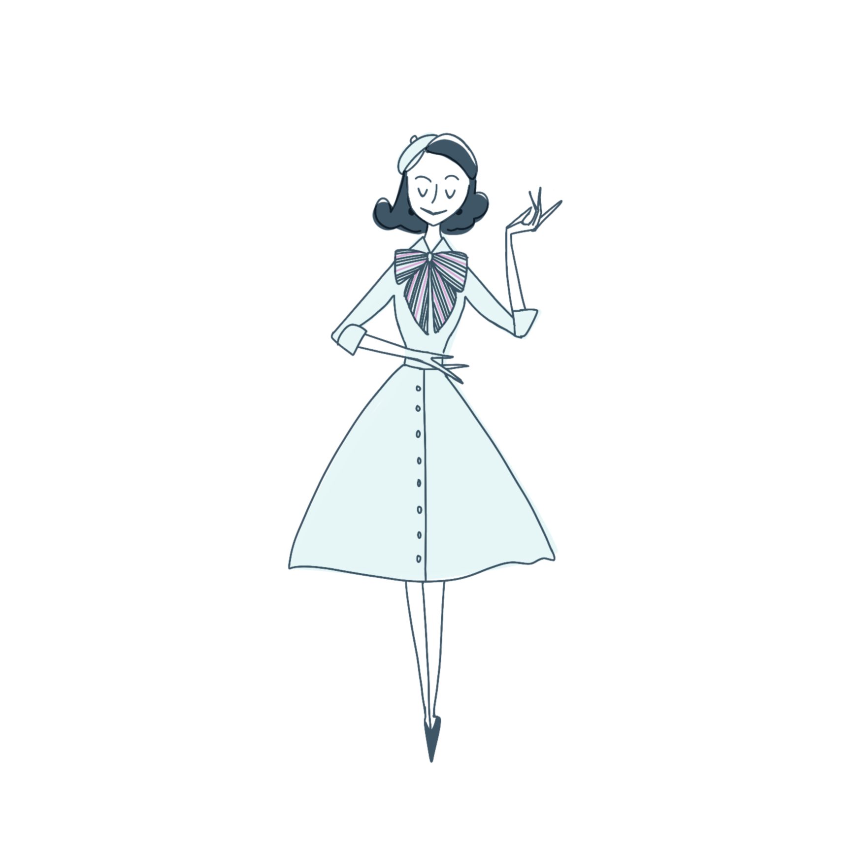
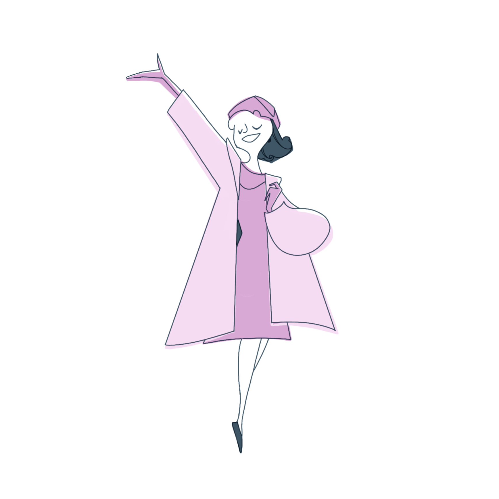
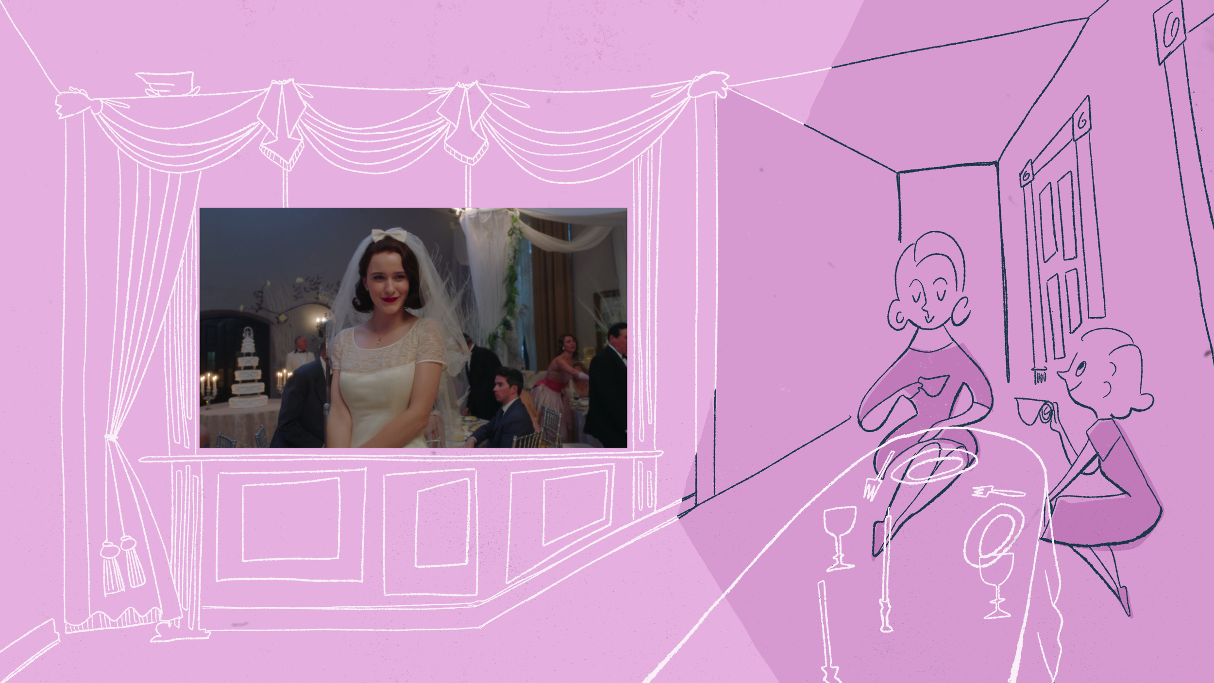
Fashion and silhouette are a big part of the design and appeal of the show, so I did a few alternate designs highlighting fashion.
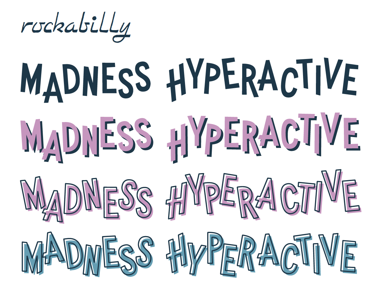
Because the font for the show logo was already established all I had to do was find fonts to complement the logo that fit into the 50’s animation aesthetic.